new bunnybear:
Splodeyface
drawn in Illustrator, from a pencil sketch I scanned
Showing posts with label drawings. Show all posts
Showing posts with label drawings. Show all posts
Thursday, August 26, 2010
Wednesday, August 4, 2010
Drawing From the News
Striking factory worker in today's Times:
It is definitely not a great drawing, but it's an ok drawing. Drawn in a 9x12 moleskine, using a koh-i-nor mechanical pencil with HB lead only. It just feels good to be doing some freehand work and that it looks somewhat like the original source.
http://www.nytimes.com/imagepages/2010/08/04/business/jp-paycuts.html
Saturday, February 27, 2010
WD-40
Drew a can of WD-40. Finished product looks like freshman drawing class still life assignment. I am pleased enough with it. Cloud drawing coming next, you can see part of it poking out from behind the moleskine. Feels good to know that I can still render objects from life with some facility.


Location:Sackett St,Brooklyn,United States
Monday, November 9, 2009
Ryan McGinness
I remember meeting this guy at an opening at Rare when it was back on 14th Street, probably around 1997 or 1998. I think he was handing out matchbooks or stickers with his puking guy icon and the word, "art" on it. Maybe. Memory is a funny thing. I think he was working at PopSmear Magazine at the time, and we spoke on the phone a few times. He put me on his mailing list, so I have some cool early postcards from him, including a metallic foil invite to the book party for "Flatness is God" that happened at B Bar. The party was fun, and I bought a book, which was originally published by Soft Skull Press (now defunct.)
I remember one phone conversation we had, where I was trying to garner some sage advice from him, and he was telling me about this book project he was working on, that is was pretty intense, and how I shouldn't get so caught up worrying about making gallery art, or getting into the galleries, etc. I was extremely impressed and inspired by the first book, and have a growing library of his publications, a few prints, and at least one tee shirt. Most recently found the issue of Arkitip he was in for half-off at the Staple clearance space down on Ludlow. I passed up buying the Peter Saville issue, which was a lot cheaper, because I wanted/needed the McGinness one.
His show earlier this year at Deitch Projects filled me full of wonder and laughter; how cool is it that he gets to make work that is so much FUN and that I find meaningful as well. I have the press release and some notes I made about that show and maybe someday I'll get around to writing something more substantial about it, but I am certainly happy to have the Arkitip catalog for it.
Was reminded all of this when SwissMiss posted a video of him working and talking about his work on her blog. The video is from Upper Playground, SF-based art/design/fashion collective, or whatever they would like to be called.
SwissMiss writes:
Ryan McGinness is interested in creating a new vocabulary for everyday symbols and icons through context and composition. Using layering, repetition, and juxtaposition, his complex pieces construct worlds within worlds. With his massively intricate silk-screened paintings, sculptures, and installations, hes able to blur the division between design, pop culture, and fine art. Ryan McGinnesss artwork has appeared in numerous books, magazines, and exhibitions throughout the United States and Europe.
Labels:
art,
bad art,
commercial work,
conceptual art,
criticism,
deitch projects,
design,
Digital Collage,
Digital Imaging,
doodle-splody,
drawings,
graffiti,
inspiration,
ryan mcginness,
swissmiss
Wednesday, September 2, 2009
old stuff: Cracked Out Snowmen
Wednesday, June 24, 2009
Prince's Purple Rain
I remember listening to this album constantly when it came out. I had the 45" of "When Doves Cry" and my sister had the LP, and we'd listen to it at our house and her best friend, Jennifer Wentzel's house. I would sing, "this is what it sounds like, when dogs dieeeee!!!" I didn't know what "Darling Nikki" was about, but I wanted to. Spin just published a huge feature package marking the 25th anniversary of the release of the movie and album, and they got a bunch of bands to cover the album. Best part for me? I got to do the photo-illustration for the cover under art direction from Devin Pedzwater.
This first sketch is something I threw together that didn't get used. I had done a few different ink versions before I scanned this and colored it in photoshop. It got me very comfortable with the image, which helped when I made the final.
 This is the final version, as it looks on newsstands.
 And this is the original photo, by ASP.

This first sketch is something I threw together that didn't get used. I had done a few different ink versions before I scanned this and colored it in photoshop. It got me very comfortable with the image, which helped when I made the final.
 This is the final version, as it looks on newsstands.
 And this is the original photo, by ASP.
Thursday, May 28, 2009
look at this fucking hipster
Monday, April 13, 2009
Drawing from the news: Grieving Sports Fans
Thursday, April 9, 2009
old stuff: 1 Window
old stuff: NERDCORE logo
old stuff: Makrolab
Tuesday, March 31, 2009
Tuesday, March 24, 2009
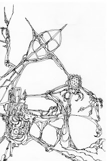
 Drew on a printout of a distressed scan of another drawing. There's definitely some Lebbeus Woods influence coming into this, and maybe a bit of sumié landscape painting as well.
Tuesday, March 10, 2009
Monday, January 19, 2009
doodlesplody

 Scratched out the simpler one on a 5x7 pad of paper from Spin. Scanned it in, printed it out on 8.5x11 paper and just kept going. Not sure if that version is done, but I scanned it in, and I'm going to print it out again and add another level to it. I'm just going to work on this one drawing over and over again for the rest of my natural born life. Repetition with improvisation. Lather, rinse, repeat.
Sunday, December 7, 2008
album art: Indelible Beancurd

Cover art

Interior art
check them on their site and on amazon.
Wednesday, December 3, 2008
monogram 1: Oh My God
 I have always loved interlocking monograms; usually I notice them as sport's logos, but they are all over the place. They are an optical illusion, an Escher-like puzzle for the eyes to sort out.
The more complex the design, the more letters involved, the longer it will take to figure it out, but our eyes and brain seem to have an amazing ability to sort these things out, similar to reading a sentence wth sme of th lttrs mssng without skipping a beat. I think that I am also drawn to these things because they take type and make it into an image, maybe through decorative means, but still. I think I can track this back to looking at the Star of David iconography at the synagogue I went to growing up, and trying to follow the lines around and over and under and through, trying to make sense of it, in my head. I spent many hours drawing and re-drawing these, tracing them until I could draw them on my own.

So I decided to try making some of my own. The question was, what would I make them for, what would the letters I chose represent? I immediately thought I would use instant messaging acronyms, since the juxtaposition of the slow labor-intensive process of drawing these with the hurryupnow nature of their etymology seemed at odds. This strikes me as a similar intent to the slow-blogging movement, though not as crusty or bitter. My intent is to do it as an homage, a glorification of our newfound method of simplified communication. All that being said, here is my first effort. This is a scan of a pencil drawing, colored digitally. I will see what they look like re-drawn in vectors, but I like the idea that they have an element of the non-digital in them as well.

Wednesday, August 6, 2008
FRED
Subscribe to:
Posts (Atom)


